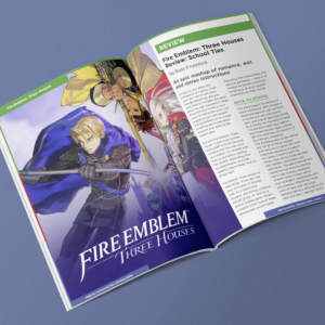
This project had me work with type a bit more, specifically trying to make already written type like nice in a magazine format. I have an interest in gaming, so I pulled so I pulled articles to use and got to work. I wanted to use a consistent three color tone (red, blue, green) for the magazine to represent the big three gaming companies (Nintendo, Sony, Microsoft).
I came up with the name Patch Notes, since that is term used in gaming a lot to indicate an update. The name was also not used in any previous real gaming magazines, so I felt it stood out more.
Overall, I wanted to find a sleek design. Something that didn’t seem to typically “nerdy”. I’m pleased with the end result and it taught me all about how to look for clean type, work with type in a column setting, and working with type around pictures.
Take a look at my work on Patch Notes below!

