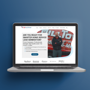
AdMachines, a company focusing in lead generation for home services, was looking to rebrand their site going into 2021. I was tasked with coming up with all the graphics and translating my boss’s website vision into reality. This was the first website I created from skeleton to completion, and I learned many valuable UI/UX principles throughout the project. The entire site was made in HubSpot, and all of the graphics were created by me.
The vision for the site was a clean site with well-utilized white space, but didn’t feel empty. Another way to describe it would be a site that had very careful planning of its layout, and is brought to life with simple, but clean graphics. During my planning phase, I wanted to use a lot of abstract shapes in the background of the graphics and during page transitions. I felt it gave the page a softer look, while still being fun and fitting with the overall theme of simple and effective.
User navigation wise, I tried to make all of the content go in a flowing order that was easy to follow. Our whole site was designed to be a 24/7 salesperson for our company, so I also created many bright CTA’s and buttons where we wanted user action. For example, there is a bright red floating CTA block that gives the user our number. This is just so they never will have difficulty contacting us.
Overall this project was a fun challenge that helped me combine the principles I know in both graphic design and web design.
Take a look at the website I created for AdMachines below!

