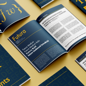
My font book was a project I did to explore typography in a deeper way. The book contained many fonts I loved using, mainly so I could showcase all these font families and their individual typefaces.
I wanted to create a branding for the book, so it wasn’t just white pages with text on it. I decided to go for a blue and gold theme. I felt the blue was pleasant to look at as the main color on the pages, and the yellow helped pop against the blue, and it also helped the font really stand out while on the blue background. The also feel this color combination made the book feel a little more sophisticated.
The book was broken into “chapters”, with each chapter being a new font. Within each chapter, a different typeface from the type family was showcased on each page. This allowed each typeface to get it’s own page to shine, and the reader could compare to another page in the book to see which typeface would be better for their project. The top of each page shows all the characters in the typeface. Then I wanted the reader to get examples of blocks of text, so I showcased 6 examples of the text in different sizes and with different line spacing. Finally, I used an example sentence at the end so the reader could easily see the font in a simpler, but bigger example.
Check out my font book below!

