These typographic posters were a project I completed for college. I choose Gill Sans due to my love for the typeface. The assignment was to create three posters: one that showed off the history of the typeface, one that showed off the unique attributes of the typeface, and one that showed off famous places it is used.
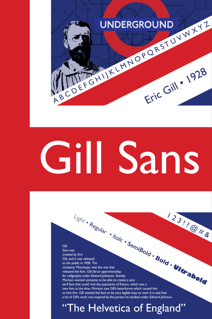
For the origin poster, I wanted to play around with designing inside the British flag, since this is where Gill Sans was born. I decided to show off the type face in some of the white space. I also included some pictures that related to the history in the top of the poster.
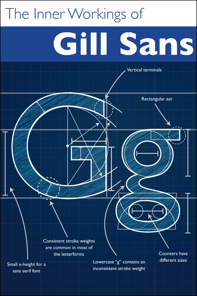
For the unique poster, I was inspired by an image I saw of the blueprint sketches of Gill Sans being made. I wanted to make a blueprint similar to that image. I highlighted some key aspects of the font and followed a fairly standard blueprint design.
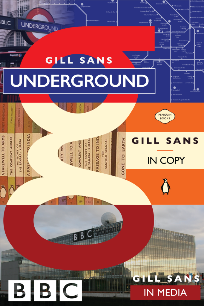
For my last poster, I had to show off where Gill Sans is used. I decided to do a big G and cut it up into thirds. Each third would represent a famous spot it was used. I also made the top of G mimic the London Underground logo.
Take a look at my three typographic posters below!